 THE GLOWNIQUE
How to Choose a Custom Neon Sign: Size, Font, Colour and Placement
A practical buyer's guide to custom neon signs: the seven decisions to make in order, from what the sign is for and how big it should be to the font, colour, backboard cut, mounting and power, with real examples from weddings, home bars and shop windows.
Key takeaways
- Decide what the sign is for before choosing words, font or colour.
- Size it from viewing distance and test with a taped outline on the real wall.
- Script fonts need more height than block fonts to keep their loops open.
- Choose the colour against the wall it will hang on, and think about photographs.
- Find the outlet and plan the cable before fixing the position.
- Approve a free true-to-scale mockup before anything is built.
To choose a custom neon sign, decide seven things in order: what the sign is for, where it will be read from, how big it needs to be, which font survives being bent in light, which colour suits the wall, how the backboard is cut, and how it will be mounted and powered. Get those right on a free mockup before anything is built.
Most people start with the words and the colour. Those matter, but they are the easy part. The decisions that decide whether a sign looks right on the wall are the ones people make last, or not at all: how far away it will be read, what the wall behind it looks like, and where the plug is. This guide takes them in the order that saves you a redesign.
The seven decisions, in order
- Purpose: is it a feature piece, a name, a logo, or information someone has to read?
- Sign type: LED neon, or one of the other illuminated sign types that suits the job better.
- Size: set by viewing distance and wall width, not by what looks big on a phone screen.
- Font: chosen for how it bends in light, not how it looks in a word processor.
- Colour: chosen against the wall it will hang on.
- Backboard cut: square, shaped or cut to the letters.
- Mounting, power and placement: where it hangs, where the cable goes, and whether it lives indoors or out.
1. Start with what the sign has to do
A neon sign does one of three jobs, and each one pulls the design in a different direction.
A feature piece sets a mood: a phrase over a sofa, a word on a bar wall, a backdrop for photographs. It can be expressive, because nobody needs to read it quickly.
A name or logo identifies someone: a family name in a living room, a couple's names at a wedding, a studio logo behind reception. It has to be recognisable at a glance, so it rewards simpler letterforms and a single strong colour.
An information sign has to be read: "Open", opening hours, a menu. Legibility beats style every time, and a sign whose message changes is often better as something other than neon.
Write down which job your sign is doing before you choose anything else. It settles half the arguments that come later.
2. Check that neon is the right sign type
LED neon is the right answer for most feature pieces, names and logos with clean lines. It is not the right answer for everything, and the honest comparison between neon and signs of other types is worth a minute before you commit.
| Sign type | What it is | Best for | Read more |
|---|---|---|---|
| LED neon | Flexible LED neon flex hand-bent to your words and mounted on acrylic | Phrases, names, simple logos, feature walls, events | [Custom LED neon signs](/products/custom-neon-signs) |
| Glass neon | Gas glowing inside hand-bent glass tubes on a high-voltage transformer | Heritage restorations and authentic vintage light | [LED neon vs glass neon](/guides/led-neon-vs-glass-neon) |
| Channel letters | Individual 3D metal letters lit from inside | A business name on a façade or a reception wall | [Channel letter signs](/business-signs/channel-letter-signs) |
| Slim lightbox | A lit frame under an inch deep with a printed face | Menus, windows and promotions that change | [Lightbox signs](/business-signs/lightbox-signs) |
| UV-printed acrylic | Full-colour print on acrylic, traced with LED neon | Logos with gradients, photos or fine detail | [Acrylic logo signs](/business-signs/acrylic-logo-signs) |
The difference between LED and glass neon is the one people ask about most. Glass neon is the original: gas in glass, driven by a high-voltage transformer, and repairable by a skilled bender. LED neon is a line of LEDs inside a flexible silicone jacket that runs on low-voltage power, with no glass tubes and no gas. For a sign that hangs in a home, a venue or a wedding, LED is almost always the practical choice. The full comparison is in our guide to LED neon vs glass neon.
3. Size it from where people will read it
The most common mistake is choosing a size on a screen. A sign that looks generous in a mockup on your phone can disappear on a real wall, and one that looks modest can dominate a small room.
Start with viewing distance. For signs facing the viewer, the US Sign Council's rule of thumb is about 1 inch of capital-letter height for every 30 feet of viewing distance, so 10-inch letters read at roughly 300 feet. That rule is written for business signs seen from a street, but the principle scales down: the further away the audience, the taller the letters need to be. Our guide to what size sign you need has the full letter-height table.
Indoors, the simplest test beats any formula. Cut the outline of the sign from paper or mark it with masking tape at the size you are considering, stick it where the sign will hang, and look at it from where people will actually stand or sit. Take a photo from that spot. If the words are hard to make out in the photo, go bigger or shorten the wording.
We make custom neon signs from about 30 cm wide to several metres, so the size can follow the wall rather than a list of stock dimensions.
4. Choose a font that survives being bent in light
A font is drawn for ink. Neon draws it with a single glowing line, and some letterforms do not survive the translation.
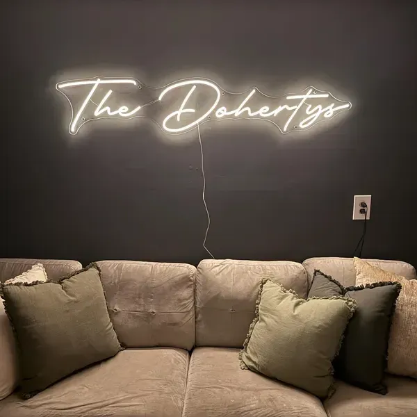
Script fonts are the most popular choice for names and phrases, and they are also the most demanding. Tight loops close up, thin connecting strokes can merge with the letters beside them, and very ornate capitals turn into tangles at small sizes. The fix is usually size, not a different font: script needs more height than a block font to keep its loops open.
Block and sans-serif fonts read well at almost any size and from further away, which is why they suit logos, business names and anything someone has to read quickly. A common and effective combination is a script word for personality paired with a block word for clarity, for example a script first name over a block surname.
You do not have to judge this in the abstract. The free mockup shows your exact words in your chosen font at true scale, so you can see whether the loops stay open before you commit.
5. Choose the colour against the wall, not the swatch
A neon colour looks different on every surface. Warm white on a white wall reads soft and elegant; the same warm white on dark paint looks brighter and more dramatic. Saturated colours such as hot pink and ice blue throw coloured light onto the wall around them, which is part of the effect and worth planning for.
Three practical rules help:
- Contrast first. Pick a colour that stands out from the wall and the room's main light. A pale sign on a pale wall in daylight can vanish.
- Think about photographs. At weddings, events and in salons, the sign ends up in pictures. Warm whites and soft pinks flatter skin; strong blues and greens colour everything near them.
- Match the brand, not the logo file. For a business, choose the tube colour that reads as your brand in light, then confirm it on the mockup.
We make custom neon in 13 colours, plus RGB colour-change for a sign that switches between them. Brand colours are matched to your Pantone or HEX references as closely as the materials allow. For deeper help, read how to choose the right neon colour for your sign, or for businesses, see how brand colours are matched on custom logo neon signs.
6. Decide how the backboard is cut
Every LED neon sign sits on a clear acrylic backboard, and how that backboard is cut changes the character of the piece as much as the colour does.
- Cut to square: a clean rectangular panel that frames the glow. The most practical and forgiving option.
- Cut to shape: one panel that follows the outline of the whole design. Tidier on the wall, still easy to mount.
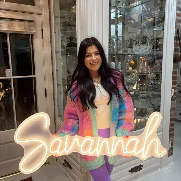
- Cut to letter: acrylic cut closely around each letter, so the words look as if they are drawn straight onto the wall. The most striking finish, best on a smooth wall.
If you are unsure, ask for more than one on the mockup and compare them side by side.
7. Plan mounting, power and placement
This is the decision people leave until the sign arrives, and it is the one that most often leads to a visible cable across a wall.
Find the outlet first. Indoor LED neon runs on 12V from a plug-in power supply, so the sign needs a standard outlet within reach of its cable. Decide where the cable will run and where the power supply will sit before you choose the exact position on the wall.
Choose the mounting method. Most signs mount on standoffs screwed into the wall, which hold the backboard a little away from it, or hang from a hanging kit. Standoffs look cleaner; hanging suits walls you cannot drill and event backdrops. For a wedding or event backdrop, our wedding neon sign backdrop guide covers hanging in detail.
Think about dimming. A sign that is perfect at a party can be too bright in a bedroom at night. An optional wireless dimmer lets you set the brightness to the room.
Indoors or outdoors? An indoor sign should stay indoors. If the sign is going outside, it needs to be built as an outdoor sign from the start, and an IP rating on the LED strip is not proof that the finished sign is weatherproof. Read whether LED neon signs can be used outdoors before you order one for a patio or a shopfront.
Care and lifespan
LED neon needs very little looking after: an occasional wipe with a soft, dry cloth, and a power supply kept dry and ventilated. A rated LED lifetime describes when the LEDs fade to a set share of their original brightness, not when the sign stops working, and the power supply is usually the first part to need attention. Every sign we make carries a 5-year warranty. For the detail, see how LED neon signs are made, which explains what a rated LED lifetime means, and the care questions answered on our custom LED neon sign page.
How these choices play out in three real settings
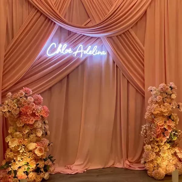
A wedding backdrop
A name sign at a wedding is read from across a room and photographed hundreds of times. That favours a script font large enough to keep its loops open, a warm white or soft pink that flatters skin tones, and a hanging kit so the sign can go up on a backdrop and come home afterwards. Plan where the couple will stand, then size the sign to sit above their heads rather than behind them. See our wedding neon signs for designs.
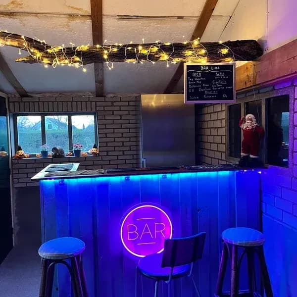
A home bar
A bar sign sets a mood in a room that is usually dim, so a saturated colour works harder here than anywhere else in the house. A short word or the bar's name reads better than a long phrase, and a dimmer earns its place once the evening gets going. Keep the power supply away from sinks and spills. Browse home bar neon signs, or neon bar signs for venues if it is a commercial bar.
A shop window
An open sign or a name in a shop window is an information sign first: it has to be read from the pavement, often in daylight. That favours block letters, a bright colour that contrasts with what is behind the glass, and a size set by the distance to the far side of the street. If the message changes, a slim lightbox may serve you better than neon. See custom neon open signs and retail storefront signs.
How ordering a custom neon sign works
- Send your idea: the words, a font you like or your logo, and ideally a photo of the wall.
- Get a free mockup: a true-to-scale preview showing size, font, colour and backboard cut.
- Revise and approve: change anything until it is right. Nothing is built before you approve.
- Order and receive: payment runs through our Etsy shop, where eligible orders are covered by Etsy Purchase Protection. We ship worldwide with tracked delivery, and your shipping cost is confirmed with your quote before you pay.
Ready to design yours?
Send us your words, a photo of the wall and a rough size, and we will reply with a free mockup showing exactly how your custom neon sign will look. Start your custom LED neon sign.
Frequently asked questions
- What size neon sign should I get?
- Size it from viewing distance and the wall, not from a screen. For a bedroom or living room wall, a sign roughly a third to half the width of the furniture beneath it usually looks balanced. For anything read from further away, use the letter-height rule of about 1 inch per 30 feet, and always test with a taped outline on the wall first.
- Which font is best for a neon sign?
- Script fonts suit names and phrases, and block fonts suit logos and anything that must be read quickly. Script needs more height than block to keep its loops open, so if you love a script at a small size, go larger or pair it with a block word. The mockup shows your exact words so you can judge before you commit.
- Can you turn my logo into a neon sign?
- Usually, yes. Logos with clean lines translate well into LED neon. Logos with gradients, photographs or very fine detail are often better as UV-printed acrylic traced with neon, which keeps the detail in print. Send the file and we will show you the options on a mockup.
- Do I need an electrician to install a neon sign?
- Not for an indoor LED neon sign: it plugs into a standard outlet and mounts on standoffs or a hanging kit. Signs that are hardwired, including exterior channel letters, are mounted by a local sign installer and connected by a licensed electrician.
- Can I see the sign before I pay?
- Yes. Every custom sign starts with a free true-to-scale mockup, and nothing is made until you approve it.
Sources
- Sign Legibility Rules of Thumb — United States Sign Council (accessed 26 September 2026)
- Preservation Brief 25: The Preservation of Historic Signs — US National Park Service (accessed 26 September 2026)
- Lifetime and Reliability (solid-state lighting fact sheet) — US Department of Energy (accessed 26 September 2026)
- Ingress Protection (IP) ratings — International Electrotechnical Commission (accessed 26 September 2026)
Turn the idea into a sign
Send us your logo, words or a rough sketch and we'll come back with a free digital mockup and a quote for your exact size — before anything is built.