 THE GLOWNIQUE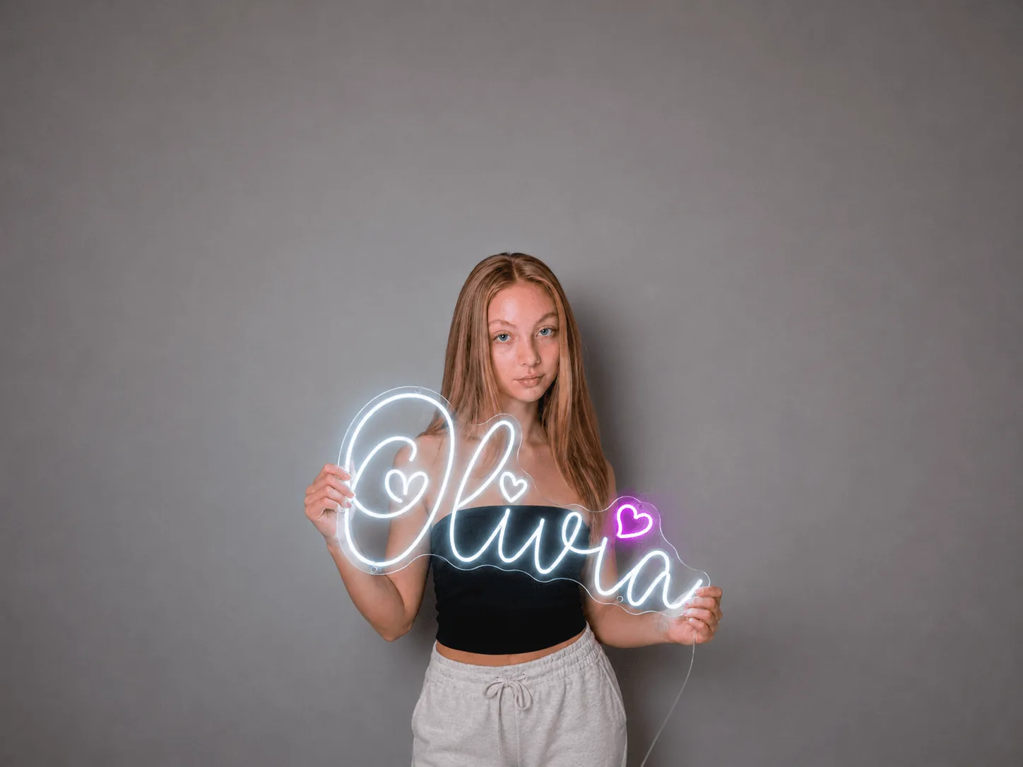
How far away can sign letters be read?
The United States Sign Council (USSC) measures legibility with a Legibility Index (LI): the number of feet of viewing distance per inch of capital-letter height.[1][2] Its average LI is 30, so 1-inch capitals read at about 30 feet and 10-inch capitals at about 300 feet.[1][2] The measure is the height of the capitals, not the overall size of the sign.
Thirty is an average, not a constant: the Council's figure for black Clarendon lettering on white is 31.[1][2] Use the chart as the starting point for any sign that faces the people reading it.
| Capital-letter height | Readable to about (sign facing the viewer) |
|---|---|
| 1 in (2.5 cm) | 30 ft (9 m) |
| 2 in (5 cm) | 60 ft (18 m) |
| 3 in (7.6 cm) | 90 ft (27 m) |
| 4 in (10 cm) | 120 ft (37 m) |
| 6 in (15 cm) | 180 ft (55 m) |
| 8 in (20 cm) | 240 ft (73 m) |
| 10 in (25 cm) | 300 ft (91 m) |
| 12 in (30 cm) | 360 ft (110 m) |
| 18 in (46 cm) | 540 ft (165 m) |
| 24 in (61 cm) | 720 ft (219 m) |
| 36 in (91 cm) | 1,080 ft (329 m) |
Our arithmetic: capital-letter height in inches × 30 = distance in feet, so 6 in × 30 = 180 ft. The 30 is the USSC average Legibility Index; metric figures are rounded.[1][2]
What viewing distance should you size for?
For a sign aimed at passing traffic, USSC starts from the driver: the viewer reaction distance, how far a driver travels in the time allowed to react, sets the letter height.[1][2]
- Viewer reaction distance (ft) = speed (mph) × reaction time (seconds) × 1.47
- Capital-letter height (in) = viewer reaction distance ÷ Legibility Index
The 1.47 converts mph into feet per second. For the reaction time, the Council's rules of thumb are about 8 seconds on simple roads under 35 mph, about 10 seconds on complex roads, and 11 to 12 seconds on high-speed multi-lane roads.[1][2]
Worked example at 35 mph
On a complex road at 35 mph, allow 10 seconds: 35 × 10 × 1.47 ≈ 515 feet, and 515 ÷ 30 ≈ 17-inch capitals (our arithmetic). The Council's own figure for a sign facing traffic and read from 500 feet is about 17 inches.[1][2]
| Traffic | Reaction time | Reaction distance | Capital-letter height |
|---|---|---|---|
| 30 mph, simple road | 8 s | about 350 ft (108 m) | about 12 in (30 cm) |
| 35 mph, complex road | 10 s | about 515 ft (157 m) | about 17 in (44 cm) |
| 55 mph, high-speed multi-lane road | 11–12 s | about 890–970 ft (271–296 m) | about 30–32 in (75–82 cm) |
Our arithmetic from the USSC formulas, rounded. The speeds are examples: pick the reaction time that fits your road.[1][2]
For a sign read on foot or across a parking lot, measure the real distance instead.
When do letters need to be bigger?
Two adjustments push the letter height up.
In the 35 mph example, that turns 17-inch capitals into about 21 inches in moderate congestion and about 26 inches in high congestion (our arithmetic: 515 ÷ 25 and 515 ÷ 20).
How big should letters be on a storefront sign?
A fascia sign on the front of a building usually runs parallel to the road, so passing drivers see it side-on. USSC sizes these signs with a Legibility Index of about 10, which means letters about three times the height of a sign that faces traffic.[1][2]
Its equation works from the road in front of the sign: letter height (in) = (number of traffic lanes × 10 + setback from the road edge in feet) ÷ 5.[1][2] The Council's example, two lanes and a 20-foot setback, gives 8-inch letters. A four-lane road with the sign 30 feet back gives (4 × 10 + 30) ÷ 5 = 14 inches (our arithmetic).
Reading distance is where parallel signs struggle. Read from 500 feet, a parallel sign needs capitals of about 50 inches, against about 17 inches for a sign facing traffic.[1][2] In the Council's field study, drivers missed 30% of parallel signs, even though those signs were two to three times larger.[1][2]
If drivers must read the fascia from their reaction distance, size it at the index of 10, about 51 inches at 35 mph on a complex road (our arithmetic), or add a sign that faces oncoming traffic. For people across the street, who see the fascia face-on, the index of 30 is the better guide.
Lighting matters too on storefront signs: steep viewing angles, like dark or rough walls, reduce the legibility of halo-lit letters, and a face-and-halo combination is suggested in those cases.[3][4] Compare front-lit, halo-lit and dual-lit letters.
How much empty space should a sign have?
The Council's legibility guidance covers the space around the words as well as their height: keep negative space at 60% or more of a panel sign's area.[1][2] That leaves no more than about 40% for the words and graphics (our arithmetic). On a 4 × 2 ft panel, 8 square feet in all, that is about 3.2 square feet of copy.
If the letter height you need will not fit inside that 40%, cut words or enlarge the panel rather than squeeze the lettering. The rule is for panel signs, such as lightbox signs and printed acrylic panels.
What size sign do I need indoors?
Indoor distances are short, so the arithmetic gives small numbers: at the USSC average of 30, half-inch capitals read from 15 feet and 1½-inch capitals from 45 feet (our arithmetic).[1][2] Treat that as a floor. For a neon name over a bed or a logo on a reception wall, the wall and the viewpoints decide the rest:
- Decide where people will stand: the two or three spots the sign must work from, such as the entrance, the queue, a table, the bed or the camera.
- Work out the smallest letters. Divide the longest distance in feet by 30 for the capital-letter height in inches; add about 15% for all capitals.[1][2]
- Measure the wall, and everything that interrupts it: doors, switches, shelves, a headboard, a back bar, the furniture below.
- Mark the outline with tape at the size and height you have in mind, then look at it from each spot on your list.
- Check it in the free mockup, which shows the design to scale before you order.
- Reception walls
- Seen first from the entrance, then from the desk and the waiting seats, so measure from the door. See office and reception signs.
- Bar and café walls
- Seen from the door, the queue and the far tables, and sometimes through the window; a sign read from outside needs the outdoor distances above. See restaurant and café signs.
- Bedrooms
- Seen from the bed and the doorway, a few feet away, so the bed, the headboard and the furniture below set the size. See bedroom and home signs.
- Wedding backdrops
- Guests see it from their tables and the photographer frames it behind the couple, so mark it out with two people standing in front. See wedding neon signs.
How high should a sign hang where people walk?
In the US, where the ADA Standards apply, a wall-mounted object on a circulation path whose leading edge is more than 27 inches and not more than 80 inches above the floor may project no more than 4 inches (100 mm) from the wall.[5][6] At 27 inches or lower, or above 80 inches, it can project any amount, as long as the route keeps its required clear width.[7][5] The rule covers every circulation path, not only accessible routes.[6][7] A sign hung overhead on a circulation path needs at least 80 inches of headroom beneath it.[5]
Logos are not exempt. Company names and logos fall outside the ADA's sign requirements in §216, but the protruding-object limit in §307 still applies to them.[6][5]
Count the standoffs
A halo-lit letter about 3.5 inches deep, on one maker's default standoff of about 1.5 inches, stands about 5 inches off the wall (our arithmetic): over the limit if its leading edge sits between 27 and 80 inches on a circulation path.[3][4] Mount it with its leading edge above 80 inches, or keep the total depth within 4 inches.
The Glownique makes channel letters to a custom depth, from 0.8 inches, and does not install, so tell us the mounting height when you ask for a quote and pass these limits to whoever mounts the sign.
How does sign size affect the cost?
Size is one of the main things a quote is built on: taller letters and longer wording mean more material, whether that is hand-bent LED neon and acrylic backboard, the stainless steel of channel letters, or the frame and face of a lightbox. Working out the letter height you need, rather than guessing large, keeps the budget in check.
Every sign is made to order and quoted individually, with a free design mockup before you commit, and the quote confirms the cost of tracked worldwide delivery. For the other cost drivers, from lighting style to mounting, see what a custom business sign costs.
Common questions
Is there a standard sign size?
Not for a custom illuminated sign. Every sign The Glownique makes is made to order, so its size follows the wording, the wall and the viewing distance. LED neon signs can be anything from about 30 cm (12 in) to several metres; channel letters and lightboxes are sized to the logo and the space.
Is it 1 inch of letter height for every 10 feet?
Not for a sign that faces the viewer: the US Sign Council's average is 30 feet per inch of capital-letter height. About 10 feet per inch is its figure for wall signs parallel to the road, which drivers see side-on. We could not trace the popular 1-inch-per-10-feet charts to primary research.
Does a longer phrase need a bigger sign?
It does if it has to read from the same distance. The US Sign Council's legibility figures are based on capital-letter height, so at a fixed width every extra word makes the letters smaller. Work out the capital height you need first and let the width follow; the free mockup shows both.
Do script fonts need bigger letters?
This guide has no script-specific figure: the US Sign Council's index of 30 is an average, and the one typeface value quoted here is for Clarendon. So test a script instead of trusting a rule. Print the wording full size, tape it up and read it from the furthest spot, or see it to scale in your free mockup.
What do you need from me to size a sign?
The wording or logo, the width of the wall or space, where people will read it from and how far away, whether it goes indoors or outdoors, and a photo of the wall if you have one. Send them on WhatsApp with your quote request; the free mockup shows the design to scale before you order.
See your sign to scale before you order
Send your wording or logo, the wall width and where people will read it from. The free mockup shows the design to scale, and your quote comes back on WhatsApp.
Keep reading
- Front-lit vs halo-lit vs dual-lit channel letters
How each lighting style reads at a distance, and what the wall must do.
- Custom business sign cost guide
What moves the price, from size and lighting to materials and mounting.
- Wall surfaces and standoffs for backlit signs
How the wall finish and the gap behind halo-lit letters shape the glow.
- Custom LED neon signs
Made to order from about 30 cm to several metres, with a free mockup first.
Sources
- Sign Legibility Rules of Thumb — United States Sign Council, A. Bertucci (2006). Accessed 24 September 2026.
- Best Practice Standards for On-Premise Signs — USSC Foundation, Bertucci & Crawford (2018). Accessed 24 September 2026.
- Hello Halo: A Deeper Look at Halo-Lit Channel Letters — GRAPHICS PRO (2019). Accessed 24 September 2026.
- Lit Fabricated Metal Halo Lit: Specifications, Mounting, and Installation — Gemini Product Guide. Accessed 24 September 2026.
- ADA Standards, Ch. 3 Building Blocks (§307) — U.S. Access Board. Accessed 24 September 2026.
- ADA Standards, Ch. 2 Scoping (§204, §216) — U.S. Access Board. Accessed 24 September 2026.
- Guide to the ADA Standards: Protruding Objects — U.S. Access Board. Accessed 24 September 2026.