 THE GLOWNIQUE
Illuminated Signage in 2026: What Changed, and What to Ignore
Most signage trend pieces are a list of shapes that were popular last year. This one is written for someone with a budget: what has genuinely shifted in how businesses use light, what each shift costs in effort rather than fashion, and which trends are not worth chasing.
Key takeaways
- The biggest real shift is that signs are commissioned as photographic backdrops as much as identification — which changes size, height and placement more than it changes style.
- Halo-lit metal has moved from premium-only to a default for interiors, because it photographs well and reads as considered rather than loud.
- Restraint is winning. Single-colour, single-mark signage is outperforming multi-colour installations in brand spaces.
- Colour-change RGB remains mostly a novelty for brand use: a brand that is any colour is not a brand colour.
- Ignore anything whose value depends on the sign being new. A sign is a five-to-ten-year object.
Trend pieces in this industry tend to be a list of shapes. This one is written differently, because the question a business actually has is not “what is popular” — it is “what should I spend on, and what will still look right in five years.”
Here is what we have genuinely seen change in the briefs coming in, and an honest note on what we would not spend on.
What has actually changed
1. Signs are being commissioned as photo backdrops
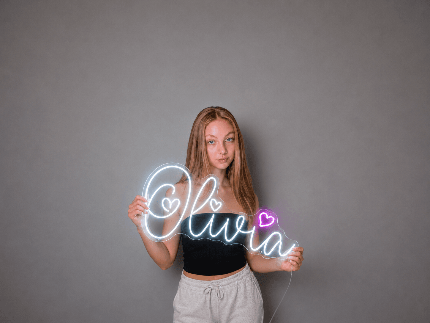
This is the big one, and it is less a style than a change in purpose. A decade ago a sign was for identification: it told people whose building this was. Increasingly, a sign is briefed as something people stand in front of — for a photo, a reel, a press shot, a recap video.
That is a specification change, not a decorative one. A photo-backdrop sign has to clear the heads of people standing in front of it, has to stay legible when a phone camera meters for a lit object in a dim room, and has to work at the distance a group photo is taken from. Signs briefed as identification and used as backdrops are almost always too small and too low.
2. Halo-lit metal has become a default for interiors
Halo lighting — where the light comes from behind the letter and washes the wall, leaving the face of the letter dark — used to be the expensive option. It is now what most reception, studio and boutique briefs ask for by default.
There is a reason beyond fashion. Halo-lit reads as restrained: the mark is a solid object and the light is an effect around it, rather than the mark being a glowing thing. It photographs well because the wall glow gives the camera something to work with. It also depends heavily on the wall behind it, which is worth understanding before committing — the front-lit vs halo-lit vs dual-lit guide covers what each style needs.
3. Restraint is beating maximalism in brand spaces
Multi-colour, multi-element installations are still being asked for, but the briefs that come back happiest are single-mark, single-colour. One mark, well made, correctly sized, in one colour that belongs to the brand.
The signs that still look right after five years are almost always the ones that were doing one thing.
4. Interiors are being lit as a system, not decorated with a sign
More briefs now arrive with the sign considered alongside the room's lighting rather than as an object added to a finished space — matched colour temperature, coordinated placement, sometimes a matching secondary piece in a different part of the building. This produces noticeably better results and costs nothing extra to think about, as long as it is thought about early.
What we would not spend on
| Trend | The pitch | Our view |
|---|---|---|
| Colour-change RGB for brand signage | One sign, any colour, on a remote | A brand that is any colour is not a brand colour. Genuinely useful in a bar, a games room or an event space that changes character; a liability on a logo. |
| Animation and chase effects | Movement catches the eye | It catches the eye once. After a week it is background, and by then it has become the thing staff turn off. Consider whether static would have done. |
| Very long text | A whole sentence or a manifesto in tube | Tube is a poor medium for reading. Past about five words, legibility drops sharply and cost rises with every character. Print the manifesto; light the mark. |
What has not changed at all
Worth saying, because it is where most of the outcome still lives. The fundamentals have not moved:
- Legibility at the distance people will actually stand.
- Contrast against the surface behind the sign.
- Getting the size right, which remains the most common expensive mistake.
- Somewhere sensible for the power supply.
- Choosing the right technology for the location, rather than the one you saw first.
A perfectly on-trend sign that is too small on a wall that gives it no contrast is a worse sign than a plain one that got those two things right.
If you are planning a project this year
- Decide what the sign is for: identification, atmosphere, or being photographed. They lead to different signs.
- Photograph the wall in the light it normally has, and send that with your enquiry.
- Measure the furthest point anyone will read it from.
- Settle where the power comes from before the design is finalised.
- Read the cost drivers before setting a budget, so the number is grounded in something.
On that last point, the custom business sign cost guide sets out what actually drives a quote — size, illumination method, materials, weatherproofing — rather than quoting figures that would be wrong for your project.
Frequently asked questions
- What is the biggest signage trend in 2026?
- Signs being briefed as photographic backdrops rather than purely as identification. It is less a style than a change of purpose, and it changes the specification: backdrop signs need to be larger, higher and placed for the distance a group photo is taken from.
- Is halo-lit signage still popular?
- More than ever, and it has moved from being the premium option to the default request for reception, studio and boutique interiors. It reads as restrained and photographs well. It does depend heavily on the wall behind it, so the wall is part of the decision.
- Are colour-changing RGB signs worth it?
- For a bar, games room or event space that changes character through the evening, yes. For a logo, generally no — a brand that can be any colour is not really using a brand colour, and the novelty of the remote wears off long before the sign does.
- How long should a business sign last?
- Treat it as a five-to-ten-year purchase, which is a useful filter for trends: if a design's appeal depends on being new or topical, you are buying a short-lived effect with a long-lived object.
- What is the most common mistake in signage projects?
- Undersizing. It is more common than any styling error and it is the one that cannot be fixed afterwards. Measure the furthest point anyone will read the sign from, and size for that rather than for how the sign looks on a screen.
Turn the idea into a sign
Send us your logo, words or a rough sketch and we'll come back with a free digital mockup and a quote for your exact size — before anything is built.